About
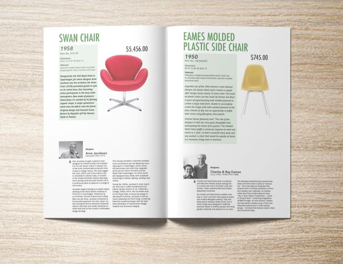
In this project, I learned how to balance textual and visual elements on a double paged spread for a chair catalog. I learned the importance of designing for a spread rather than a page. I discovered through many iterations that what may work on an individual page may not always translate nicely when put together with another individual page. Every small detail in design can be impactful as everything has a purpose and intention.
I experimented with different grids, typefaces, colors, and visual elements.
Final Draft
I changed some fonts again and incorporated tinted boxes to bring attention to different things like the designer bio. My goal for the spread was to focus on the chair and I originally tried to achieve this focus by making the title super big and the description big and bold.
I also didn’t want viewers to completely skip over the bottom section with the bio which is why I kept the darker green box as a guide for the eye.
Draft 1
I was given a page of content that included 2 chairs, their descriptions, and the designer biographies of each chair. I was to reorganize the content and compose a spread. The only limitation I had was that I could only use 1 color.
In this draft, I failed to see the total amount of text that was given, and accidentally left out half of the information (for the yellow chair).
Draft 2
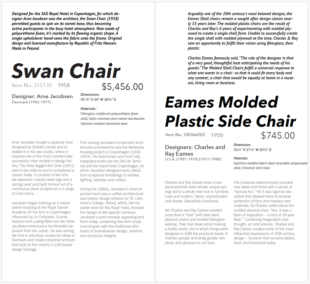
I played around more with how many columns I wanted in my grid and tried to focus on hierarchy. I thought that using gray as my additional color could work in my advantage because it changed the weight of the lines without having to change the actual font’s weight. However, besides increasing the font size and adding a color, it didn’t do a great job at creating distinction.
Draft 3
After the second iteration, I stepped away from the full catalog spread with the pictures and focused on the text only. This way, I could look at ways to emphasize the visual hierarchy using line weight, line length, color, etc. Although I thought the gray was helping me, I realized that it wasn’t and opted for an actual color in my next draft.
Draft 4
It was difficult having to pick a single, random color, but I opted for a cool color that could be read easily. I experimented with adding color to different parts of the text.
I tried incorporating other elements like lines/boxes, but soon realized that my use of them were for more decoration purposes.
I made the chairs the focus by minimizing focus on the designers. To do this, I played with the line length of the bios.
Draft 5
I changed up the font and had the description wrap around the chairs. My goal with this was to create enough white space to make it seem like there was space. I also made the bios smaller and added an intentional colored box for a more purposeful use.


