About
Hierarchy in design is typically created using different sizes, colors, and compositions of visual elements and text. Arranging elements in a hierarchal way can help guide the viewer’s eye by highlighting the key components. This can show the audience what exactly they should be looking at and what is important.
In this project, I looked into how hierarchy is created, and explored color, composition, line weight, spacing, boxes, and grids.
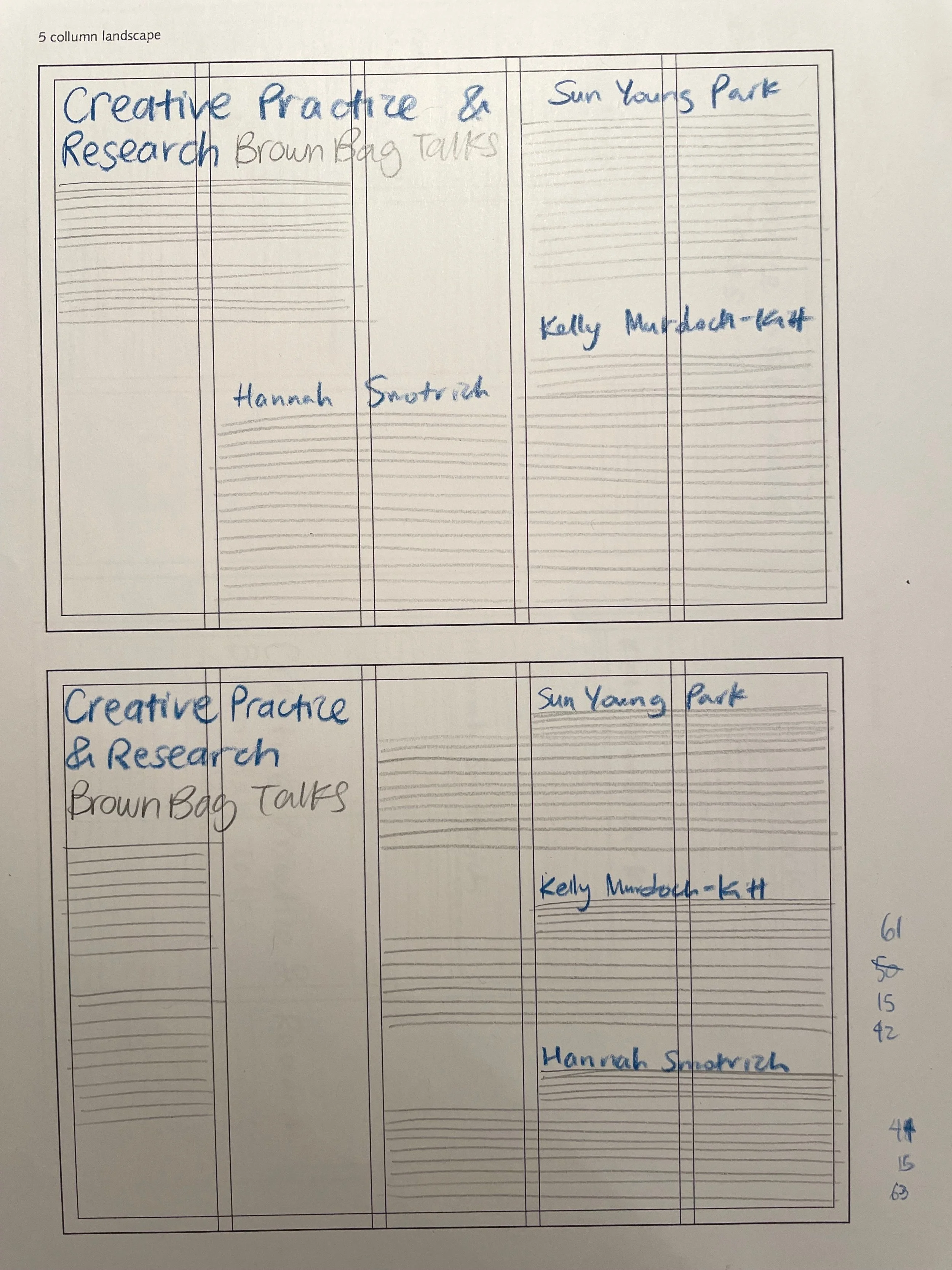
Paper Thumbnails
In this first stage, I was given a page with all the content that needed to be included in each piece. I had to use both landscape and portrait 3-column, 4-column, and 5-column grids to organize the content. I started off with rough, black and white thumbnail sketches.


Digital Finish
In this stage, I took the previous thumbnails from paper to computer. I got to see what was working/not working on paper and how it may/may not communicate the same way on a screen. I continued to work in black and white.


Paper Thumbnails
After familiarizing myself with how hierarchy functions in a piece with no color, I went forward with experimenting with just one color. Once again, I started off with paper thumbnail sketches.


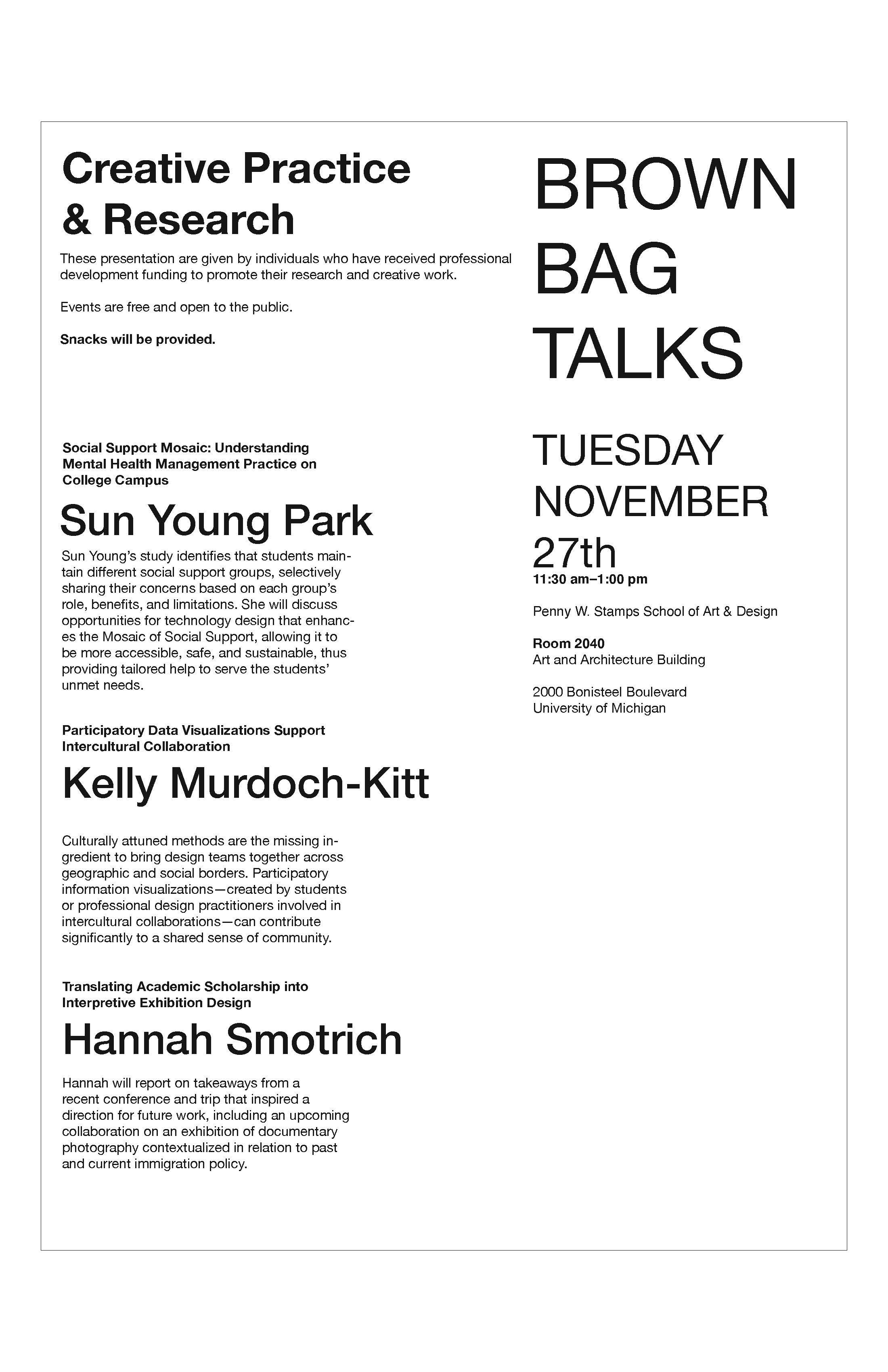
Digital Finish
After looking at what was working and what wasn’t, I moved to the computer to finish the job.


Boxes & Lines
To wrap up my exploration of hierarchy, I went forward with using 2 colors, boxes, and lines. I learned that visual elements like boxes and lines can help direct the viewer’s attention effectively, but can also distract the eye. It was a challenge figuring out what the appropriate amount of color was in this iteration.


