About
In a collaboration with Tottie Pops, a local lipgloss business, I had the opportunity to revamp their brand from the ground up. Through regular meetings every other week, I worked closely with the Tottie Pops owner to understand their preferences and vision for the brand.
Together, we developed a new logo, slogan, stationery, and packaging that reflected their unique style and voice. I thoroughly enjoyed the collaborative process and the opportunity to bring Tottie Pops' vision to life.
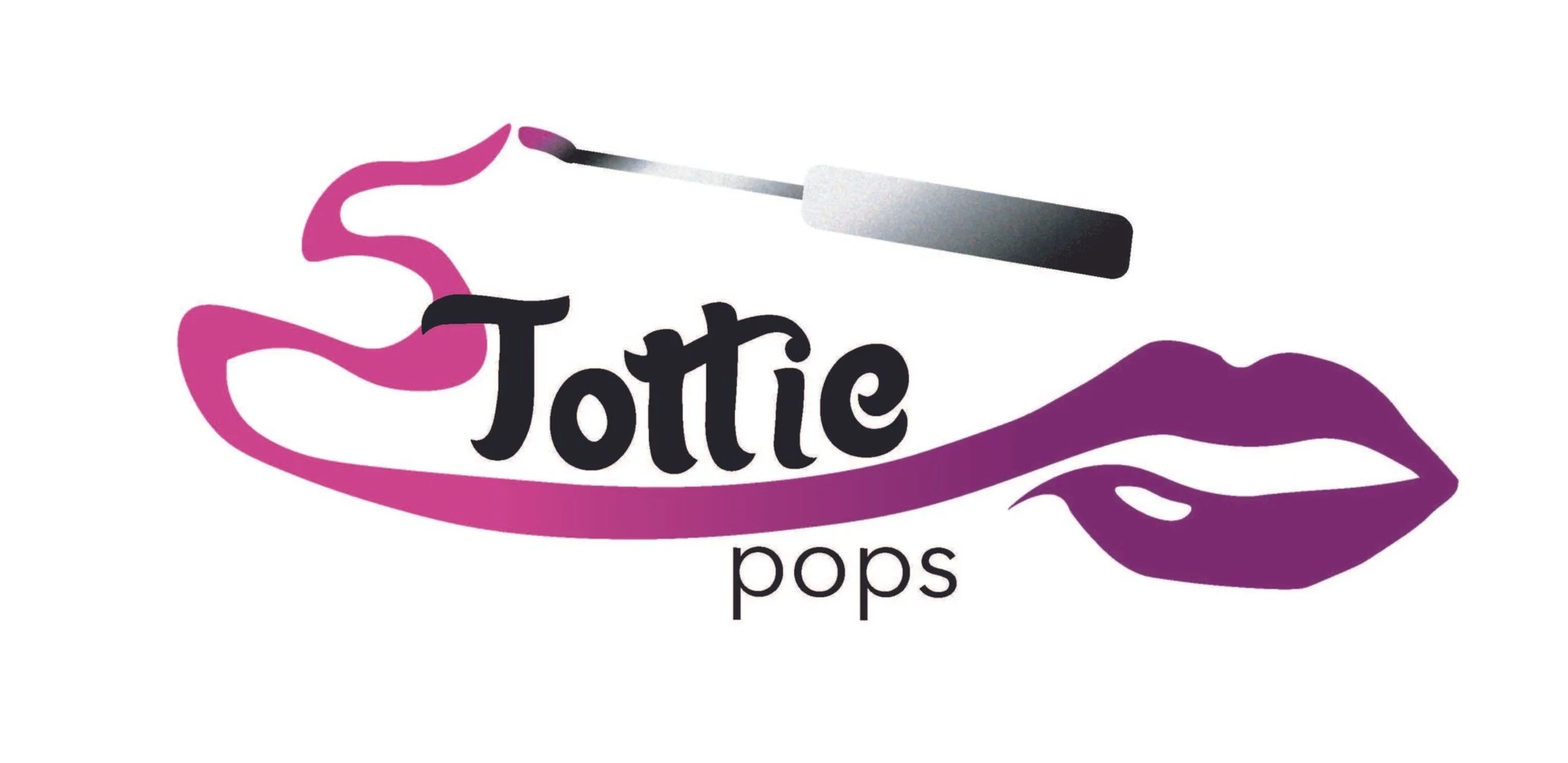
Signature Logotype
Signature Stationary
Brand Colors & Typography
Mockups
Making Process:
Research
During the first meeting with the client, I was given a presentation about the brand and the business. I took some notes to look back on for sketches and prototypes.
Inspiration Board
Upon hearing which makeup and cosmetic brands the Tottie Pops owner looked up to, I did some market research online and at stores to familiarize myself with what the design for a lipgloss product might look like.
Draft 1
Type
My main takeaway from the initial meeting was that the new visuals had to be fun and whimsical, but also glamorous and sexy.
I started in black and white, playing with the typeface and manipulating the letters. I didn’t attempt to add color until the a few iterations.
Symbol
The original slogan was “Confectionaries for the lips” so I decided to pursue graphics that related.
The existing Tottie Pops logo had a lollipop symbol replacing one of the letters, so I had thought to take that and merge it with lips. Parted lips are known to be attractive and sexy, as seen in many celebrity photoshoots.
The line in the middle was to refer back to the tube of lipgloss, while resembling a lollipop. In a second iteration, I designed more realistic lips on a stick with drips, in hopes of implying the “juiciness” of the gloss.
In my third design, I opted for a pictographic font. I preferred a classic depiction of a lollipop over the more carnival-y, kiddish one the original logo had.
Feedback:
Despite the brand’s slogan and logo making references to confectionaries and sweets, this wasn’t what the client was looking for.
The design with the drippy lip lollipop biting done on the tube seemed to be communicating a more painful feeling than sexy.
Draft 2
I left the lollipop idea behind, and went for something that screamed “lip product” more literally in Design 1. This was another attempt at making the lips look shiny and glossy, as a result of the product.
I also changed the typeface so that the emphasis landed on Tottie, since the client had specifically mentioned the backstory and significance of the name.
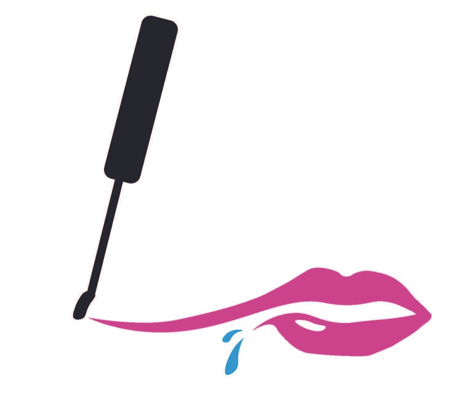
In Design 2, I wanted to focus on the lips more. I kept the parted mouth from before, and added splash marks that doubled as lip wrinkles.
Design 3 was a spin-off of Design 2. I wondered if the drips spelling out “Pops” would communicate better.
I started thinking about the designs on business cards. This gave a good idea of what was working and what wasn’t. I ultimately needed a graphic that would look good on various merchandise and stationary.
Design 1
Design 2
Design 3
Feedback:
Make sure the design is versatile and can be pasted on various surfaces (ie. lipgloss tube, packaging box, business cards, etc).
Experiment with colors and try using a paint stroke to mimic the gloss application.
Draft 3
In Design 1, I tried for a more natural brush stroke, to make it actually look like the application of the gloss. I was imagining how this design would look on the tube and designed a few compositions.
In Design 2, I messed around with the wrinkle splashes. I needed to make them obvious so viewers would understand without further explanation.
In Design 3, I flipped the colors and also experimented with the wrinkles.
At this point, I was also thinking of slogans. The client prided herself on having a wide range of colored glosses for customers and emphasized that she wanted people to feel comfortable while wearing the gloss. Hence “Take comfort in new colors”.
Design 1
Design 2
Design 3
Feedback:
Client likes the colors and what the designs are trying to communicate, but thinks the drips on Design 3 are not working. Would like to see it toned down.
Draft 4
In Design 1, I returned back to the digital rendition of the gloss application. I felt the paint stroke version wasn’t communicating enough and wouldn’t fit well on packaging. I also changed the slogan to “Glittery, Glossy, Glamourous”, 3 G’s that spoke to the product.
Previously, I couldn’t decide on how to color Design 2, but I opted for a radial gradient and let the wrinkles pop against the darker color.
For Design 3, I got rid of the drips that spelled out “pops” and replaced it with a simpler drip to convey the same message. I also looked into how this design would look on a business card.
Stickers, Box fronts, Letterheads
As my designs progressed towards completion, I got started on stickers for the lipgloss tube, box fronts, and letterheads for the client.
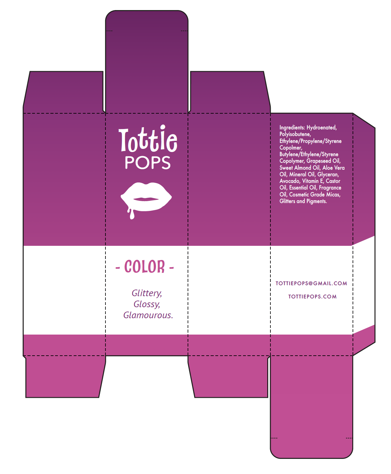
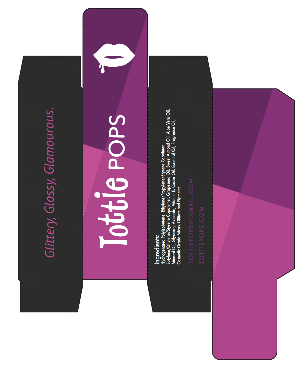
Packaging Design
I also got started on the packaging design of the boxes. I had a few ideas to pick from.
I ended up changing the font for “Tottie” into something cleaner.


